Mobile website testing: common issues and how to catch them

What’s in this article
Mobile website testing is the process of checking how a website looks, works, and performs on real phones and tablets, and its main advantage is catching layout, touch, and speed issues before your users do.

Key takeaways
- Test on real devices, not just emulators. On iPhone, almost every browser runs on Apple’s WebKit engine, which desktop Chrome can’t reproduce.
- The costliest mobile bugs hide in forms, fixed elements, and in-between screen widths, not on the homepage.
- Form fields with text smaller than 16px make Safari on iPhone zoom in on tap, a quirk that catches out plenty of teams.
- Run a separate mobile pass with a checklist before every launch and after every major design change.
- A feedback widget on the staging site lets testers report issues from their phone with browser, OS, and screen size attached automatically.
Your site looks perfect on your 27-inch monitor. Then the client opens it on their phone during a coffee break and sends you a screenshot with one line: “The menu is broken.” No browser, no OS, no idea which page.
That’s the typical mobile bug report, and it’s why mobile testing needs its own plan. Layouts that break at narrow widths, tap targets that are too small, forms that jump when the keyboard opens: none of these show up while you build on a desktop.
Why is mobile website testing different from desktop testing?
Same pages, same code, completely different bugs. A layout that’s pixel-perfect at 1440px can collapse at 360px, and a button that’s easy to click with a mouse can take three attempts with a thumb.
Three things make mobile its own world:
- Viewport variety. Phones range from roughly 360px to 430px wide in CSS pixels, tablets go well beyond that, and people rotate their screens mid-task.
- Browser engines. On iPhone, almost every browser (Safari, Chrome, Firefox) runs on WebKit, so iOS quirks hit all of them. Chrome DevTools device mode resizes the screen, but it still renders with Chrome’s own engine.
- Touch interaction. Taps, swipes, on-screen keyboards, and the lack of hover don’t exist on a desktop, and a mouse can’t fake them convincingly.
What are the most common mobile website issues?
These are the problems that come up again and again in developer communities and QA reports. Each one has a quick way to catch it before launch.
Why does the layout break at certain screen widths?
Responsive designs are built around a few breakpoints, but bugs love the widths in between. One element with a fixed pixel width, a long URL, or a wide table is enough to push the whole page sideways and create horizontal scroll.
How to catch it: in Chrome DevTools device mode, drag the viewport width slowly from about 320px up to tablet size and watch for the exact point where something breaks. If the page scrolls sideways, temporarily outline all elements with CSS to spot the one that sticks out.
Are your touch targets big enough?
Small links and icon buttons are the classic reason users tap the wrong thing. The WCAG 2.2 target size criterion sets 24 by 24 CSS pixels as the minimum for level AA, with spacing and other exceptions, while 44 by 44 pixels is the stricter AAA level and a comfortable size for thumbs.
How to catch it: go through each page on a real phone, using one hand. Anything you need two attempts to hit, such as icon-only buttons, footer links, or menu items packed close together, goes on the fix list.
Why does iOS zoom in when you tap a form field?
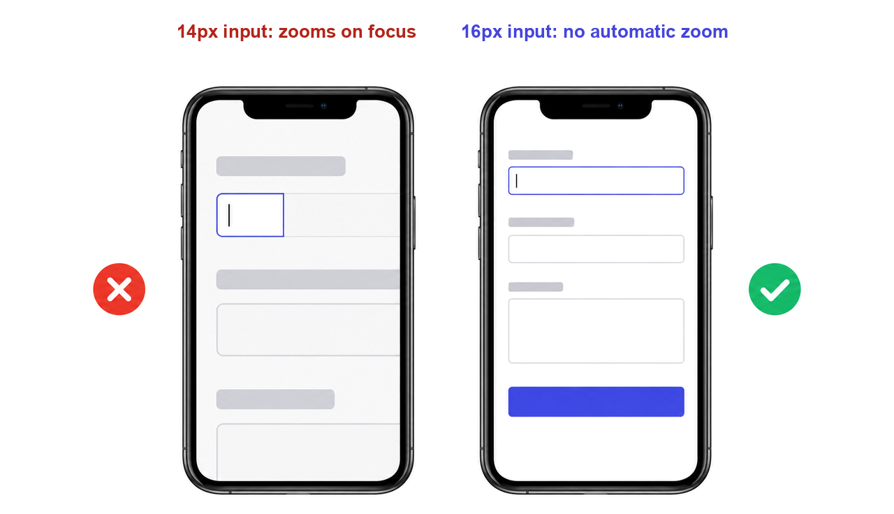
If an input’s text is smaller than 16px, Safari on iPhone zooms into the field when it gets focus, and the page often stays zoomed after the user moves on. A popular workaround is disabling zoom in the viewport meta tag, but that hurts accessibility. The cleaner fix: when you set the font size for mobile website forms, give inputs, selects, and text areas at least 16px.
How to catch it: tap every input on a real iPhone. If the screen zooms, check the computed font size of that field.
What happens when the mobile keyboard opens?
The on-screen keyboard covers a large part of the screen. Fixed footers can jump on top of it, the focused field can slide out of view, and sticky submit buttons can cover the input the user is typing into. CSS viewport units generally ignore the on-screen keyboard, so layouts built on them may not adjust when it appears.
How to catch it: fill in every form on a real device, field by field, including error states. Watch what happens when the keyboard opens, when you switch fields, and when it closes.
Why do fixed headers and full-height sections misbehave on iPhone?
Mobile browsers show and hide their address bar as you scroll, so the visible area keeps changing size. Sections set to 100vh end up taller than the screen, and fixed elements can jump or cover content. Modern CSS has an answer: the small, large, and dynamic viewport units (svh, lvh, dvh) size elements to the viewport that’s actually visible. On notched phones, also check that content respects the safe areas at the top and bottom of the screen.
How to catch it: scroll every page up and down on an iPhone in Safari and keep an eye on the header, cookie bar, and any floating buttons.
Why don’t hover menus work on phones?
Touch screens have no real hover. Dropdowns and tooltips that open on mouseover either don’t open at all, or open on the first tap and navigate on the second, which users read as “broken.”
How to catch it: open every dropdown, tooltip, and mega menu with your finger only. Each one should work with a single, predictable tap.
Why is the site so slow on mobile data?
A page that feels instant on office Wi-Fi can crawl on a phone with a weak signal and a slower processor. Heavy images, render-blocking JavaScript, and third-party scripts like chat widgets and heatmaps are the usual suspects.
How to catch it: in Chrome DevTools, set network throttling to the Slow 4G preset (the successor of the old “Fast 3G” label) and reload. Then compare the page with Google’s Core Web Vitals targets: LCP within 2.5 seconds, INP of 200 ms or less, and CLS of 0.1 or less. For concrete fixes, see our guide on how to increase website speed.
What should a mobile testing checklist include?
Use this mobile testing checklist as a separate pass before every launch and after every major design change. When time is short, start with the critical rows.
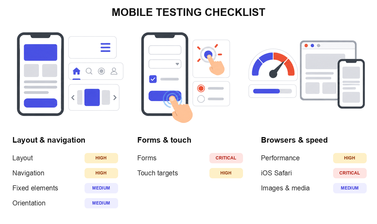
| Area | What to test | Priority |
|---|---|---|
| Layout | No horizontal scroll from 320px up to tablet width. Text readable without zooming. | High |
| Navigation | Menu opens and closes with one tap. Every link and dropdown works without hover. | High |
| Forms | Every field focusable. No zoom on tap (inputs 16px or larger). Keyboard doesn’t hide the active field or the submit button. Error messages visible. | Critical |
| Touch targets | Buttons and links at least 24x24 CSS px (44x44 recommended), with space between them. | High |
| Fixed elements | Headers, cookie bars, and chat buttons don’t cover content or CTAs. Safe areas respected on notched phones. | Medium |
| Orientation | Layout works in landscape, and nothing breaks when the phone rotates mid-task. | Medium |
| Images and media | Images load, aren’t stretched or cropped, and use modern formats like WebP or AVIF. | Medium |
| Performance | Page usable with Slow 4G throttling. Core Web Vitals in the “good” range. | High |
| iOS Safari | Tested on a real iPhone: sticky elements, full-height sections, input styling, keyboard behavior. | Critical |
If this list reminds you of bugs you’ve already chased over email, there’s a faster way. Let testers report each issue straight from their phone, with the technical details attached.
Capture mobile bugs with annotated screenshots and technical details attached automatically.
(no credit card needed)
How do you test a website on mobile before launch?
A few real devices, browser tools for the in-between sizes, and a clear way to report what testers find. Here’s how that looks in practice.
Which devices should you test on?
You don’t need a device lab. For most sites, this covers the ground:
- One current iPhone with Safari. It catches WebKit-specific issues no emulator will show you.
- One mid-range Android phone with Chrome, plus Samsung Internet if your audience uses Samsung devices.
- One older or smaller phone if your users are likely to have budget devices.
- A tablet if your analytics show real tablet traffic.
- Chrome DevTools device mode for sweeping through widths, plus the iOS Simulator in Xcode if you work on a Mac, since it runs real Safari.
Check your analytics before you buy anything. The device and browser report tells you which combinations your visitors actually use.
How do you get the staging site onto your phone?
This is where many freelancers get stuck. Your staging environment may sit behind a password, on localhost, or on a VPN your phone can’t reach. The usual options: share a password-protected staging URL, open your local server through your computer’s IP address on the same Wi-Fi network, or use a tunneling tool that gives localhost a temporary public URL.
How do you debug an issue that only happens on the phone?
Connect the device to your computer and inspect it like a desktop page. For Android, Chrome supports remote debugging through chrome://inspect. For iPhone, turn on Web Inspector in the phone’s Safari settings and connect it to Safari on a Mac. You get the console, the DOM, and network requests from the real device.
How should testers report mobile bugs?
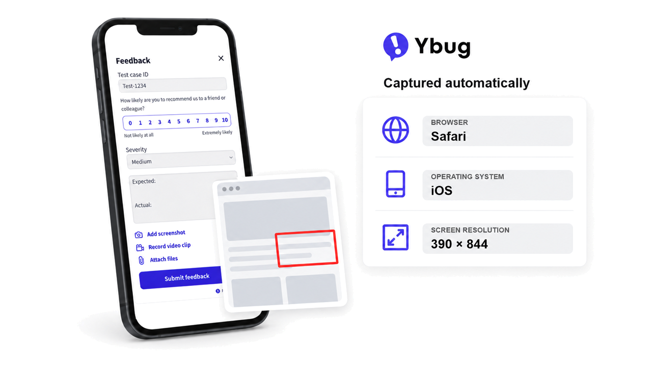
A screenshot in a chat app rarely tells the developer enough. Install a visual feedback tool on the staging site before you share the link. Testers tap the feedback button on their phone, mark up the screenshot, and send it, while Ybug automatically attaches the browser, operating system, screen resolution, and page URL. Reports go straight to Jira, Trello, Asana, or your other tools through ready-made integrations.
The hard part of a mobile bug is rarely the fix. It’s the description. Once the tester’s browser, OS, and screen size travel with the screenshot, the developer can reproduce the issue on the first try instead of the third email.
How do you run a mobile QA testing pass as a team?
Mobile QA testing works best as its own pass, not an afterthought at the end of a desktop review. Every role has a different job in it:
- Project managers schedule the mobile pass before sign-off and agree on which devices count as “done.”
- Testers work through the checklist device by device and report every issue with a marked-up screenshot.
- Developers reproduce issues using the attached environment details and fix them in priority order.
- Freelancers working alone can ask the client to join the pass on their own phone, which doubles as early client feedback.
Imagine an agency preparing a redesigned online store for launch. The PM shares the staging link with the client and two testers on Thursday. The client reports that the checkout button hides behind the keyboard on her iPhone, and because the report already shows iOS, Safari, and the screen size, the developer fixes it the same afternoon.
For a complete go-live routine, combine this pass with your broader pre-launch testing process and a website launch checklist, so nothing slips between functional QA and device testing.