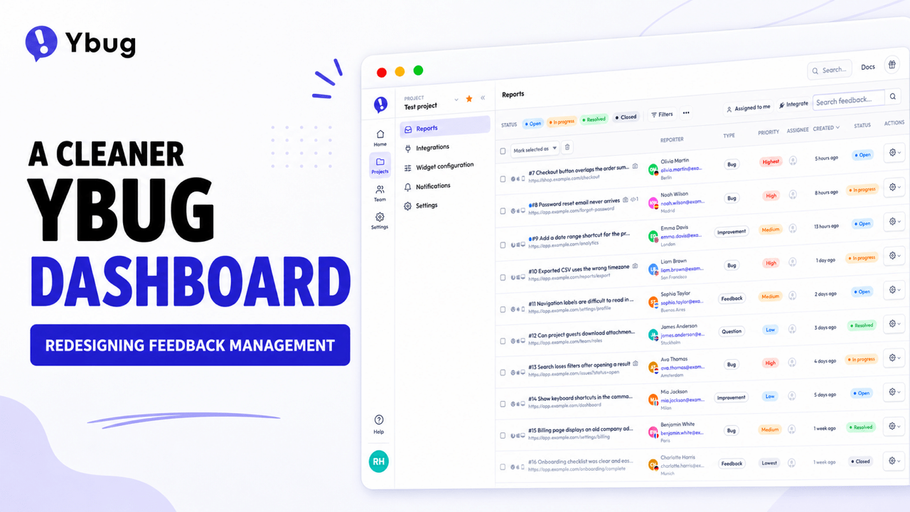
A cleaner Ybug dashboard: redesigning the feedback management experience
What’s in this article
The Ybug dashboard has a new look, with clearer navigation, a cleaner report list, and a redesigned feedback detail page.
This isn’t a complete rewrite. Most pages will still feel familiar, and that’s intentional. For this first step, we focused on the parts of the dashboard you use most: finding your way around, scanning new reports, and opening a report to work out what happened and what to do next.
The goal wasn’t to move everything for the sake of it. We wanted Ybug to feel cleaner and more up to date without losing the simplicity that makes it easy to use.
We also wanted a better foundation, so we can keep improving the dashboard one part at a time instead of disappearing for a year to rebuild everything behind closed doors.
Why we refreshed the dashboard
Ybug has changed quite a bit over the years. We recently redesigned our marketing website and refreshed the Feedback Widget, while the dashboard was still showing its age.
Most of the dashboard still worked perfectly fine. But it no longer felt like the same product as the website and widget, and improving it was getting harder than it needed to be.
We could have replaced the whole thing in one go. We decided not to.
The dashboard contains years of useful work and familiar workflows. Rebuilding all of it at once would take a long time and create a good chance of breaking things people already know how to use.
So we picked the practical route: improve the busiest parts first, keep the rest familiar, and continue from there.
Don’t redesign a product just because it looks a bit old. AI may make it cheaper to explore and build new directions, but every change still costs your users some attention. A redesign is worth it when it also makes the product easier to use, removes friction, or gives you a better foundation for what comes next.
A cleaner frame around familiar pages
The first thing you’ll notice is the new navigation.
We’ve made it clearer where you are, easier to move between projects and settings, and less distracting when you’re trying to focus on the page itself.
Most pages inside the dashboard remain familiar. That’s an important part of the plan: we can make Ybug feel more consistent and modern without making you relearn the whole product overnight.
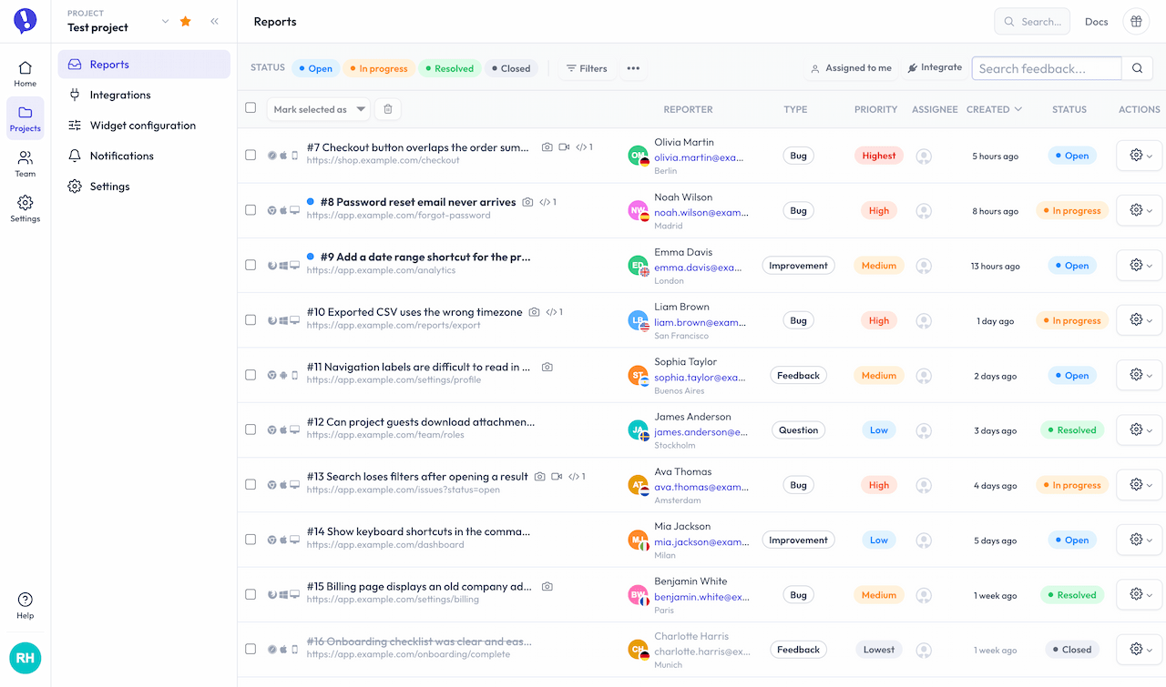
A less cluttered report list
The report list didn’t need a grand reinvention. It needed a tidy-up.
We cleaned up the visual hierarchy so titles and useful signals are easier to scan, while supporting information stays available without competing for attention.
It’s a modest change, but that’s often where a useful redesign earns its keep. You should spend less time decoding the list before deciding which report to open.
Goodbye, little retro aliens
We also stopped using Gravatar for dashboard avatars.
Gravatar was useful when someone had set one up. When they hadn’t, we used its retro fallback: a colorful, pixelated alien generated from the email address. It was cute, geeky, and very much at home in an older developer tool.
It wasn’t especially helpful for teamwork, though. A row of random aliens is difficult to connect with the people behind them, particularly when several teammates haven’t uploaded an avatar.
The dashboard now falls back to initials instead. It’s less playful, but much easier to recognize at a glance in comments, assignments, and team lists. Users who upload their own avatar will still see it as usual.
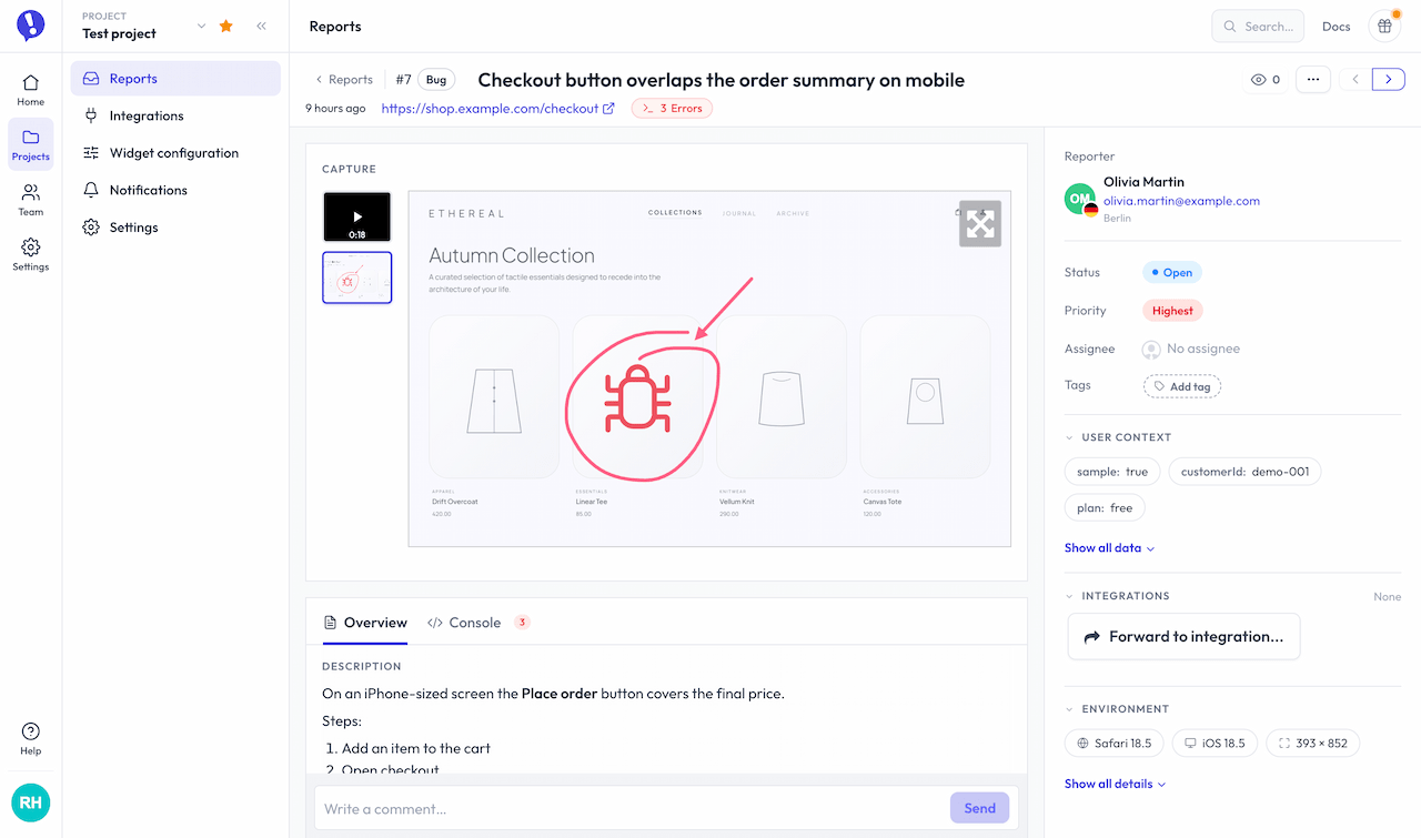
Rethinking the feedback detail page
The feedback detail page is where most of the design work went.
It has a difficult job. One Ybug report can include:
- An annotated screenshot or screen recording
- A written description
- Attachments
- Reporter and contact details
- Internal comments and public replies
- Console errors and warnings
- Browser, operating system, screen, and viewport details
- Custom user data
- Status, priority, assignee, tags, and custom fields
- Links to Jira, Linear, Trello, or another connected tool
That’s a lot of context. It’s useful context, but showing all of it at once can quickly turn a report into a wall of labels and values.
The old page had the right information, but its structure no longer matched the way we tend to review feedback. The visual evidence, conversation, actions, and supporting details didn’t have a clear enough order.
We wanted the new layout to answer three questions in order:
- What did the user see?
- What did they say, and what has happened since?
- What do we know about the report, and what should we do with it?
Start with what the user saw
The captured screenshot, video, or attachment now leads the page. That’s usually the fastest way to understand the report, so it deserves the most prominent place.
Keep the story together
The description, comments, replies, activity, and technical clues now follow a clearer reading flow. You can understand the original feedback and what happened afterward without jumping between distant parts of the page.
Keep actions and context within reach
The controls and supporting details needed to process a report stay close by. Common actions are easy to reach, while deeper context remains available without taking over the page.
The basic idea is simple: evidence first, actions nearby, deeper context one click away.
We tried a lot of layouts
The final page may look fairly obvious. It didn’t start that way.
We went through dozens of wireframes and variations before choosing this layout. We moved the screenshot around, changed column widths, tried different tabs, grouped fields in several ways, and experimented with what should stay visible or collapse.
Some versions looked beautifully clean until we added a real report with comments, attachments, custom fields, integrations, and console errors. Others showed every possible detail and ended up just as busy as the page we were trying to improve.
That’s the awkward part of dashboard design: the neat mockup with three lines of sample data is rarely the hard case. The hard case is a report from a real project, with years of features attached to it.
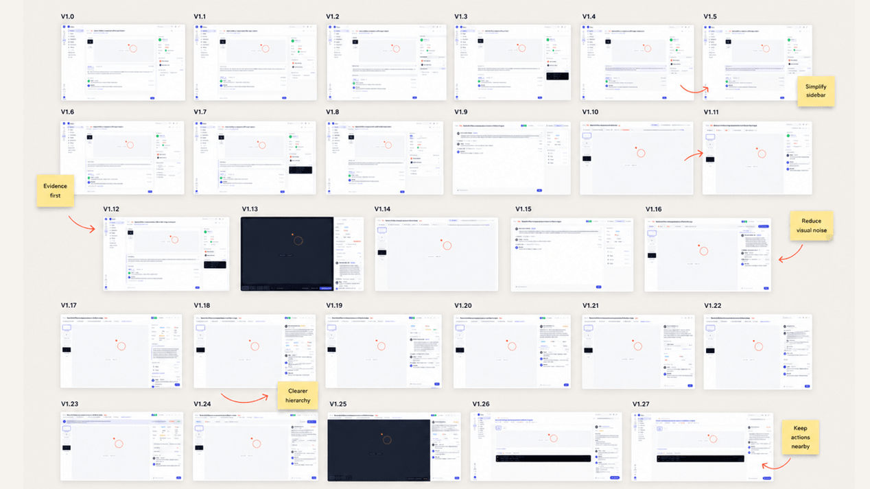
The version we shipped is the best balance we’ve found so far. We don’t expect it to be the last one.
What we haven’t changed
The way Ybug works hasn’t fundamentally changed.
Your projects, reports, integrations, comments, public replies, tags, assignments, and settings are all still there. Most older pages received updated styling so they fit the new shell, rather than a full redesign.
This also isn’t the big mobile-dashboard update. The new navigation works on smaller screens, but we haven’t yet rethought every dashboard page for mobile. We’ll tackle those areas as we continue replacing and improving individual parts.
We’d rather be honest about the scope than call the first step a finished transformation. This release gives the dashboard a cleaner interface and a better base. There’s still work to do.
What comes next
The new foundation means we can improve one workflow at a time without rebuilding the whole dashboard in one risky project.
We’ll keep adjusting the new layout as people use it. A design can make perfect sense in a wireframe and still reveal an awkward corner once it meets real projects, real data, and real habits.
That’s where we’d like your help.
If something feels clearer, confusing, slower, or simply out of place, open Help in the dashboard and choose Submit feedback. Yes, you’ll be using Ybug to send feedback about Ybug. We couldn’t really pass up that opportunity.
We’re curious to hear what you think.
